An author website has one job: to turn someone who just heard your name into a reader who can find your books, buy the one they came for, and hear about the next one. Everything on the site should serve that job, and anything that does not should go. Here is what that means in practice, page by page.
The eight things every author website needs
1. A home page that says who you are in five seconds
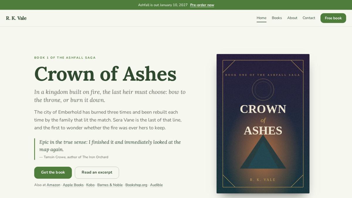
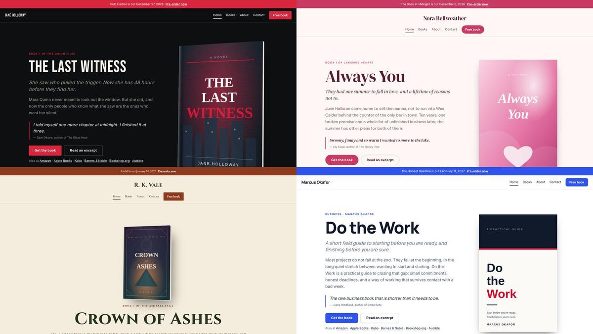
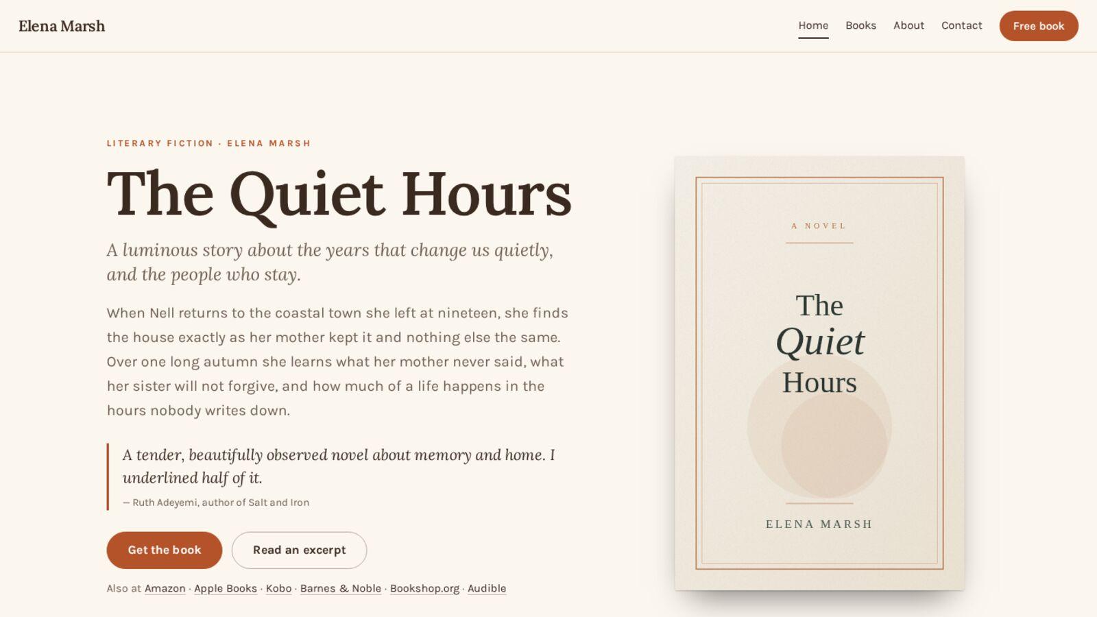
A visitor arrives from a podcast, a review or a search. Before they scroll, they should know your name, what you write, and what to do next. That usually means your newest book, large, with its cover and a one-line hook, and a single obvious button. Your genre should be visible at a glance: in the cover, the colors and the type, not in a paragraph explaining it.
If you have a series, the home page can lead with the series instead. If you have no book out yet, lead with you and a reason to join your list.
2. A page for every book
Each book deserves its own page with its own address, because each book is what someone searches for and shares. A good book page has:
- The cover, large enough to read.
- The blurb, the one from the back of the book.
- Where it sits in a series, with links to the books before and after.
- A buy button for every store and format you sell in: ebook, paperback, audiobook.
- A line or two of praise, if you have it.
A book page with no store links is a dead end. A reader who has to go to a retailer and search for you again is a reader you may have lost.
3. Series in reading order
Readers who find book three first want to know where to start. A series page that lists every book in order, numbered, with each one linking to its page, answers the most common question authors get by email.
4. A reason to join your list
"Sign up for my newsletter" is a weak offer. "Read the prequel free" is a strong one. Your site should make one offer, clearly and repeatedly: on the home page, at the end of every book page, and in a quiet pop-up for visitors who have read a page or two.
The email list matters more than anything else on this page, because it is the only part of your audience you own. A follower on a social platform sees your post if an algorithm decides they should. A reader on your list hears from you when you write.
5. An about page written for readers
Your about page is not a résumé. Readers want to know who is behind the books, why you write what you write, and a little of what you are like. A photo helps. Keep it short, keep it in your voice, and end it with the same offer as the rest of the site.
6. A way to reach you, and a press kit
Booksellers, podcast hosts, librarians and event organizers look for a contact form or an email address, and then for the things they need to feature you: a short and a long bio, a photo they may use, and your covers in a size that prints. Put them in one place so nobody has to ask.
7. Praise
A line from a review or another author does more on your site than anywhere else, because it answers the question every new visitor has: is this any good? Use it sparingly: one line on the home page, a line or two on each book, and a page that gathers the rest once you have enough of it.
8. A privacy policy
If your site collects email addresses, many places require a privacy policy, and readers increasingly expect one. It does not need to be long. It needs to say what you collect, why, and how someone can ask you to remove it.
Nice to have
- Events, if you do signings, talks or festivals. Keep past events off the page.
- A blog or news page, if you will keep it up. A blog last updated two years ago tells visitors the site is abandoned.
- Bonus content for readers: maps, character art, deleted scenes. These make good reasons to join your list, too.
What to leave off
- Anything that plays on its own. Music and video that start without a click make visitors leave.
- A splash page before the real home page. Every extra click loses readers.
- Every edition ever printed. Large-print, international and box-set editions belong on the book's page as formats, not as separate books cluttering your list.
- Old news. A "coming soon" for a book that came out last year is worse than nothing.
- More than one offer. If you ask readers to join your list, follow you on four platforms and buy three books from the home page, they will do none of it.
A checklist
- Name, genre and newest book visible without scrolling
- A page for every book, with every store and format
- Series pages in reading order
- One clear reason to join your list, on every page
- A short about page with a photo
- A contact form and a press kit
- A few lines of praise
- A privacy policy
- Works on a phone, loads fast, has your own domain
See yours
The quickest way to know what your site needs is to see it. Paste a link to one of your books and AuthorSend builds your website from it in a few seconds: a page for every book, your series in order, your praise and a signup offer, in a design made for your genre. No account needed to look.
See your author website