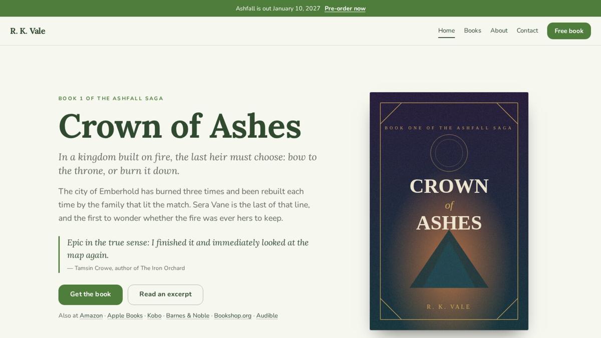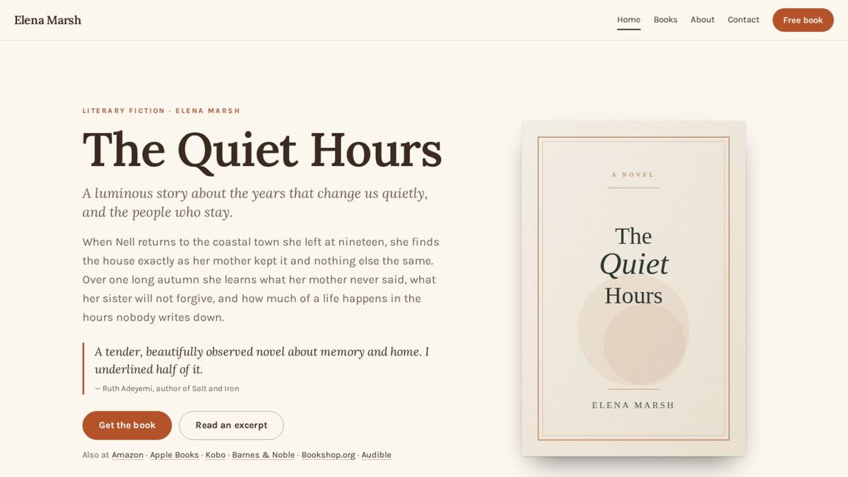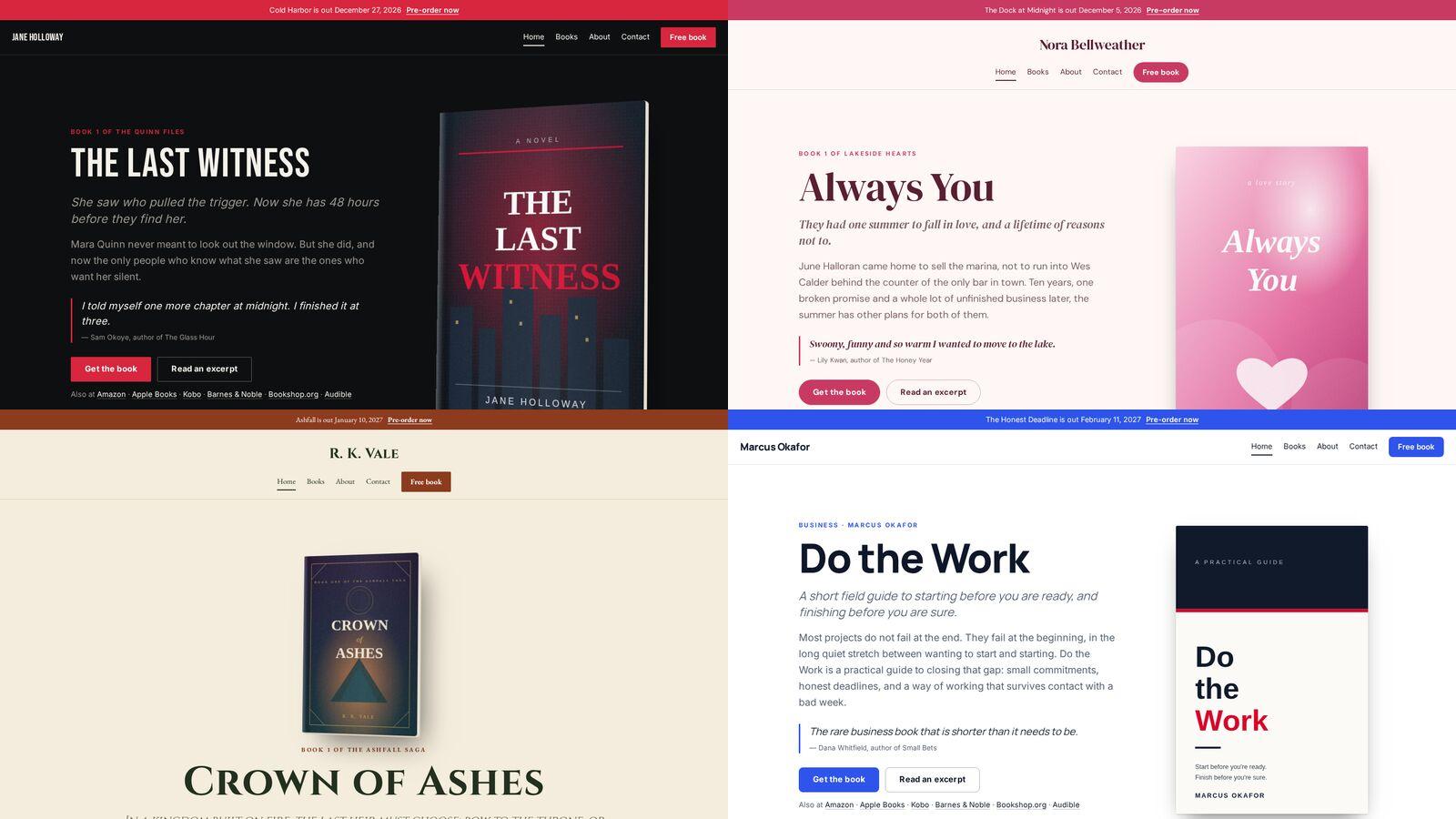
Readers decide what a book is from its cover in about a second, and they decide what an author writes from their website just as fast. A thriller site that looks like a wellness blog, or a romance site that looks like a law firm, makes readers work to understand what you offer, and most will not. Below are twelve designs, one for each family of genres, and what each one does to say its genre before a word is read.
Thrillers, suspense and crime: Nocturne
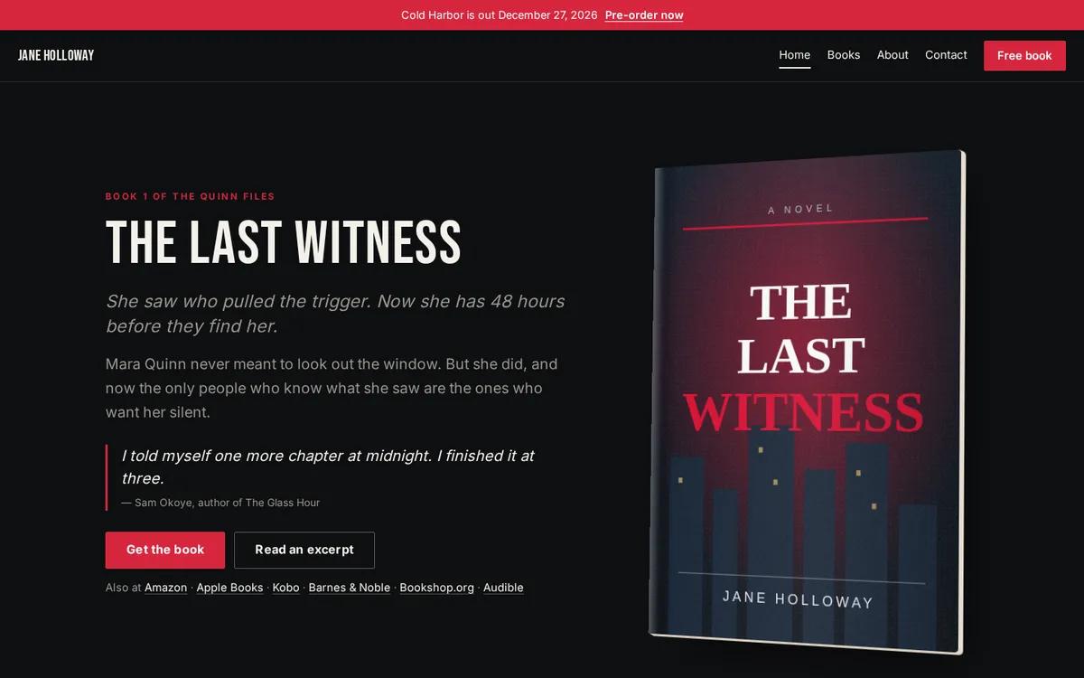
Near-black backgrounds, one hard accent color and a tall condensed headline. Thriller readers expect tension, and Nocturne gets it from contrast rather than decoration. The single red is saved for the things a visitor should do: pre-order, get the book, join the list.
Contemporary romance and rom-coms: Rosewater
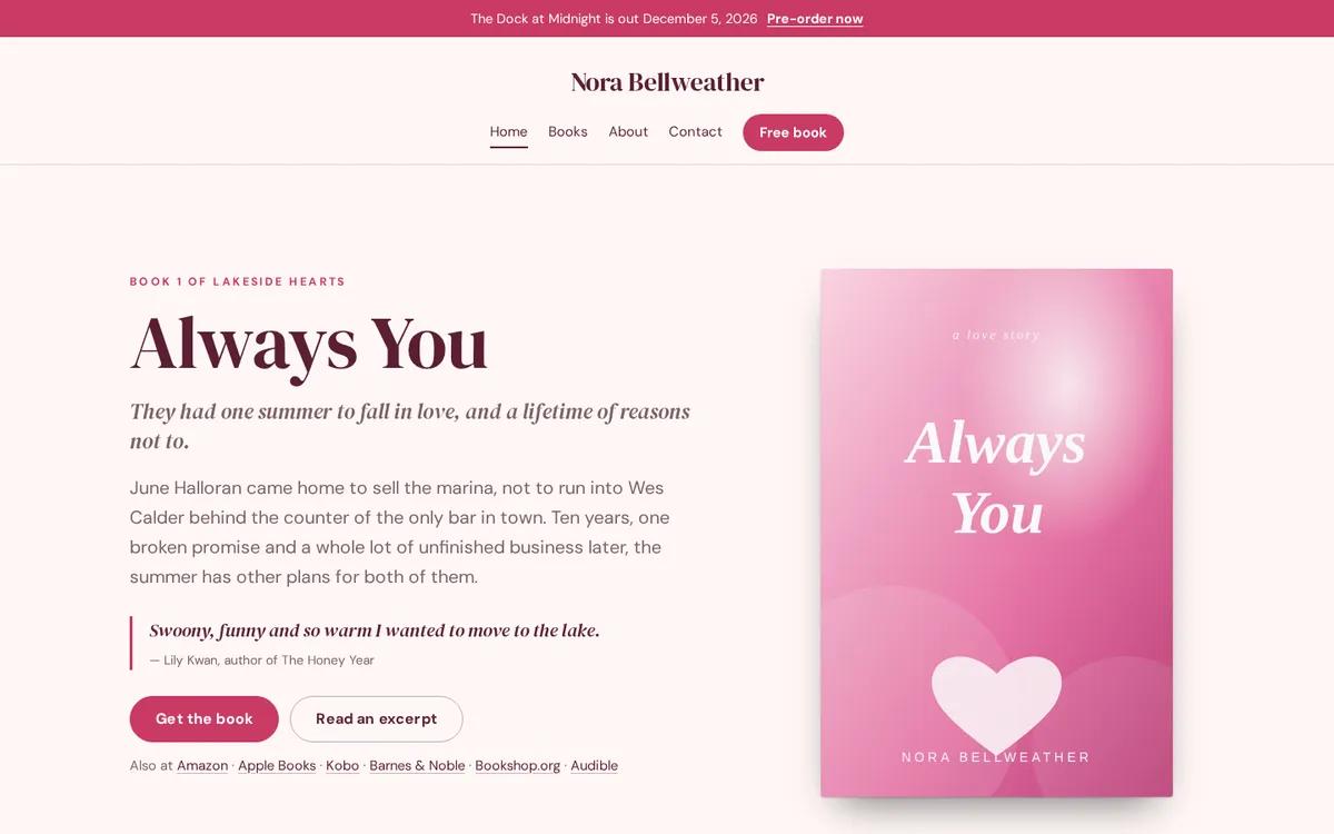
Warm whites, a soft rose and a friendly serif. Romance readers are looking for a promise of how the book will feel, and Rosewater puts the hook line and a line of praise right beside the cover, where that promise is made.
Dark romance, romantasy and paranormal: Velvet
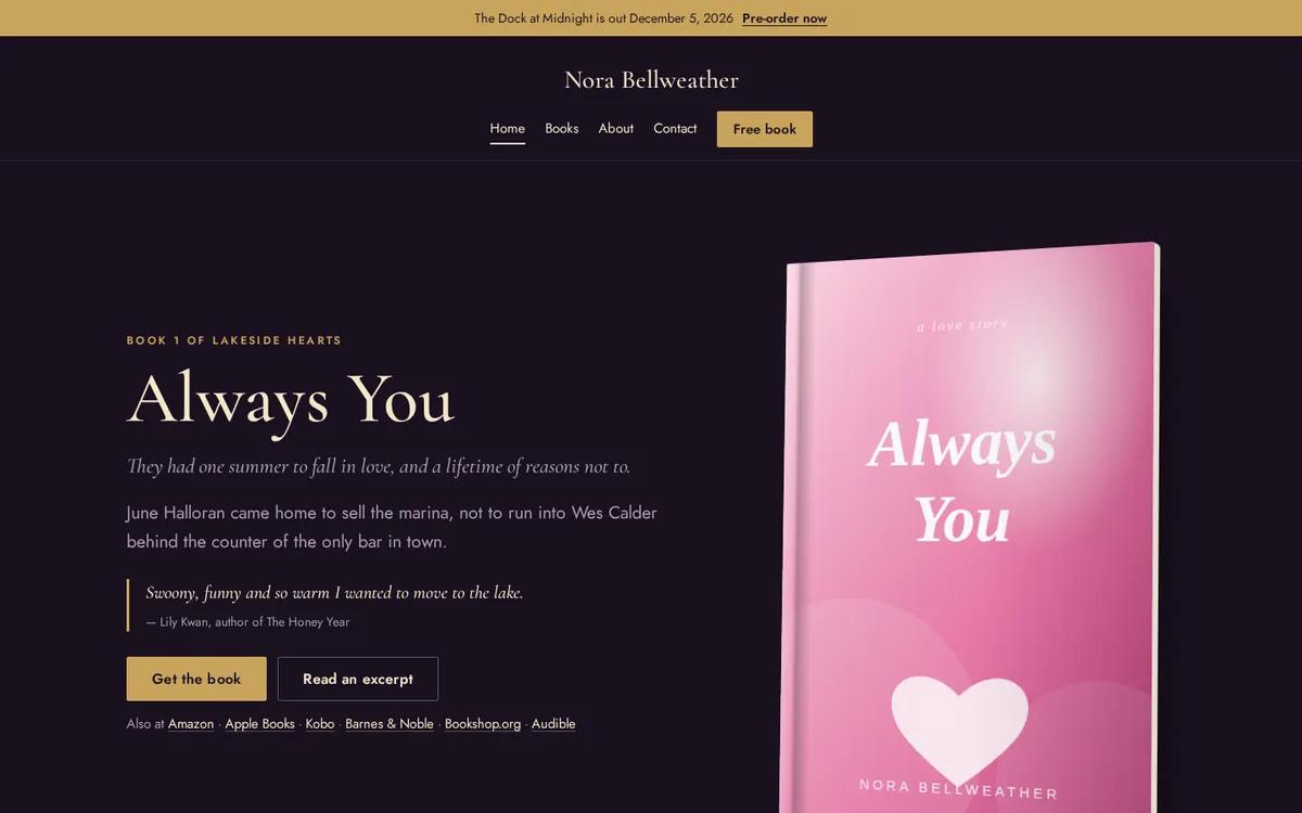
Deep plum and gold, with an elegant serif. Velvet keeps the intimacy of romance and adds the drama of the darker subgenres, without the clutter of ornament that makes these sites hard to read.
Cozy mysteries, women’s fiction and small-town romance: Hearth
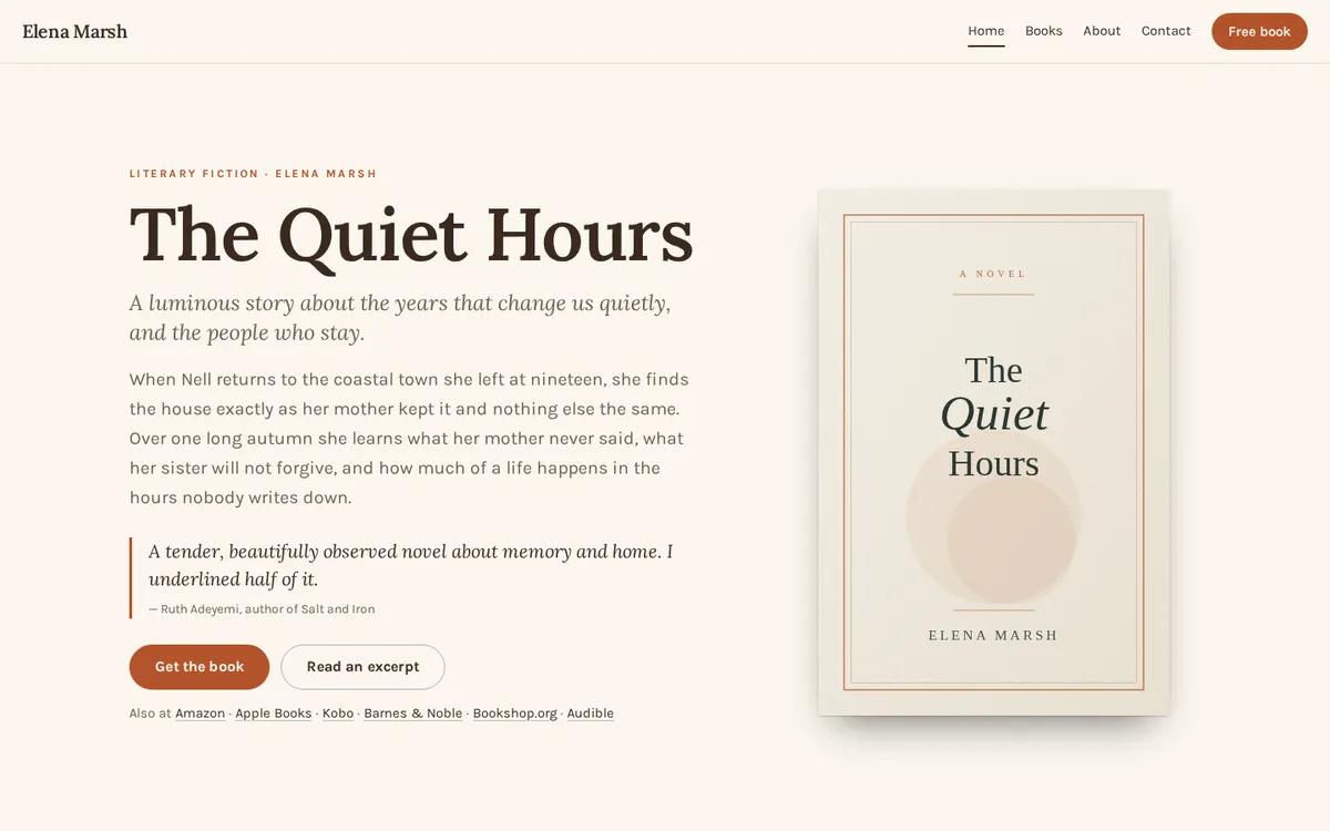
Warm cream, a rust accent, a friendly serif and rounded buttons: Hearth feels like the small town the books are set in. It keeps the home page simple, with the newest book, a line of praise and the free book one click away.
Epic fantasy and sword and sorcery: Codex
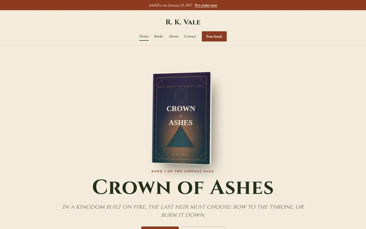
Parchment tones, small capitals and a centered cover. Codex borrows the look of a title page, which suits worlds big enough to need maps, and leaves room for long series and reading order.
Science fiction, space opera and techno-thrillers: Starfield
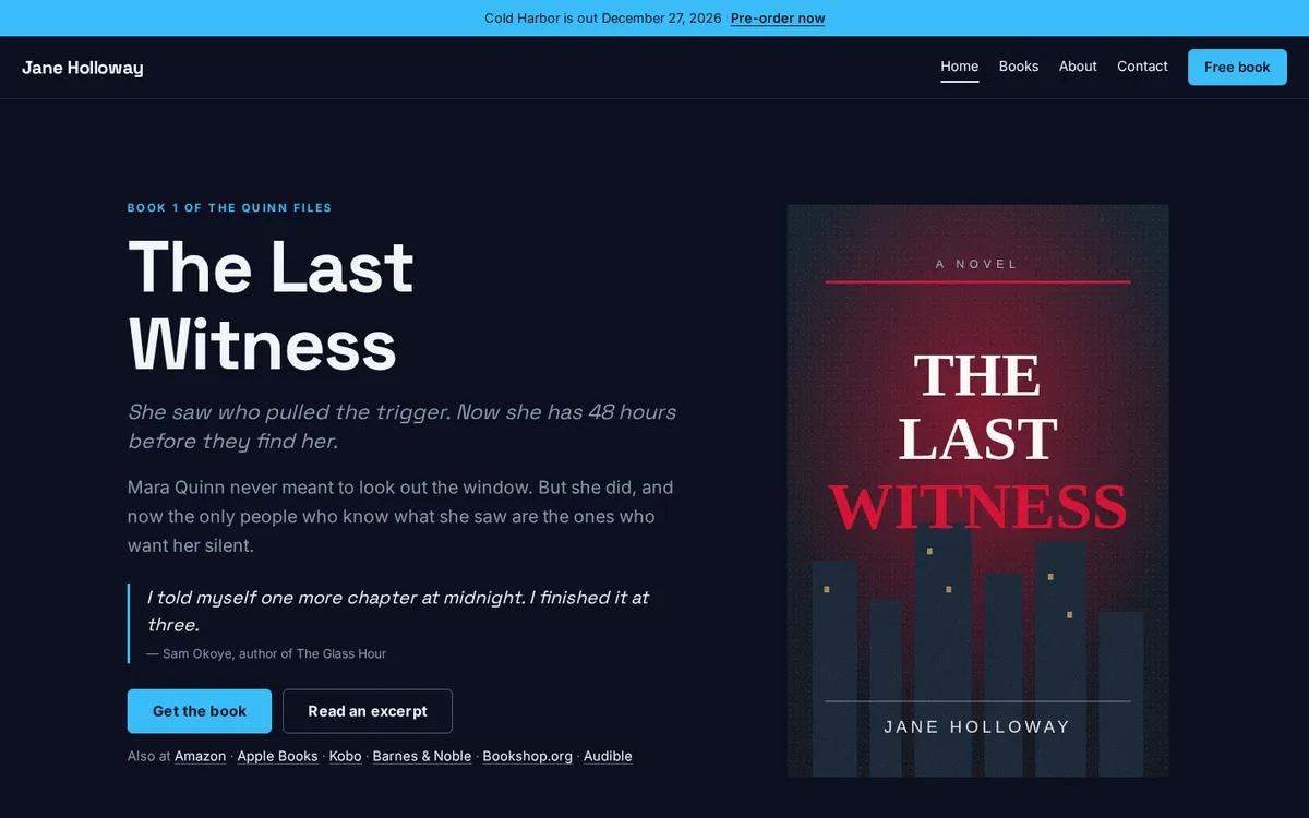
Deep navy and cool light. Starfield is spare on purpose: science fiction readers respond to clean, precise layouts, and the covers carry the spectacle.
Cozy fantasy, middle grade and gentle reads: Meadow
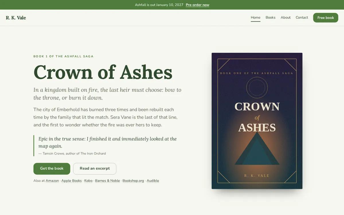
Soft greens and a storybook serif. Meadow is calm and readable, which matters for younger readers and the parents who choose books with them.
Literary fiction and book-club reads: Harbor
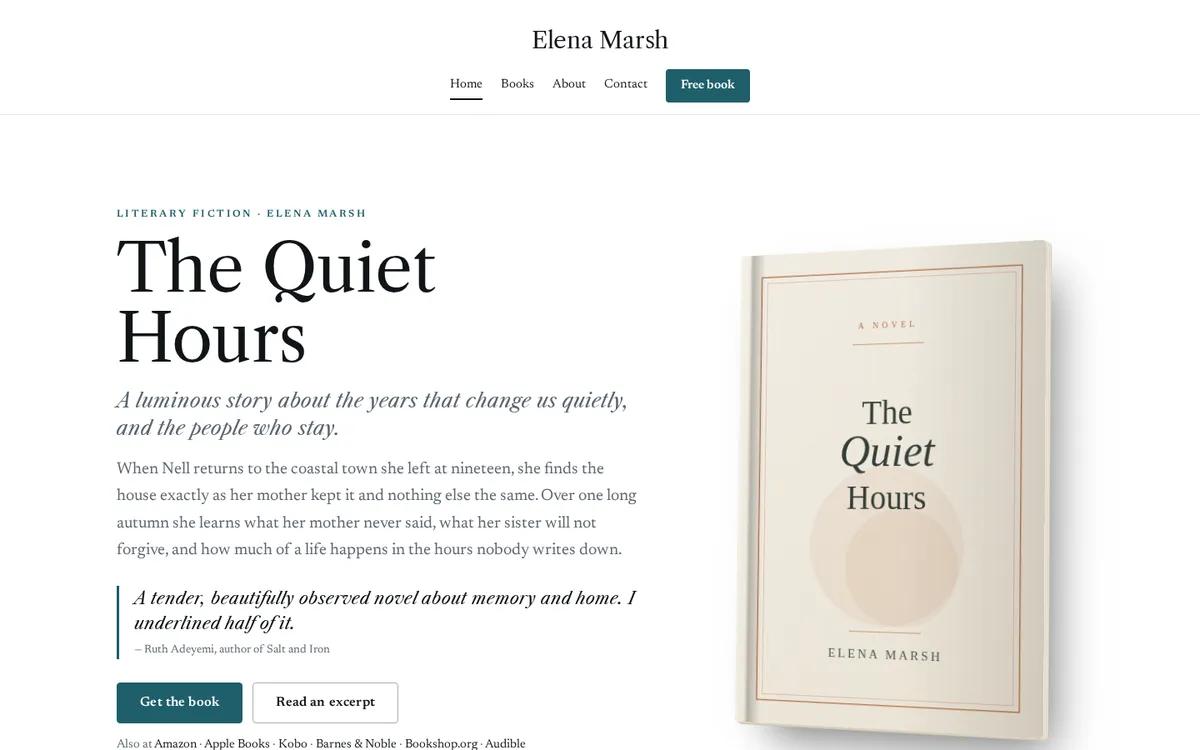
Generous white space and restrained type. Harbor lets a strong cover and a single line of praise do the work, the way a literary bookshop's front table does.
Historical fiction and sagas: Atelier
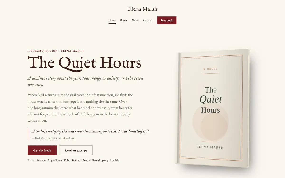
Cream, a deep red and a typeface revived from seventeenth-century printing type. Atelier has the feel of a period novel’s title page, which suits long books and longer series.
Young adult, new adult and upmarket contemporary: Saltmarsh
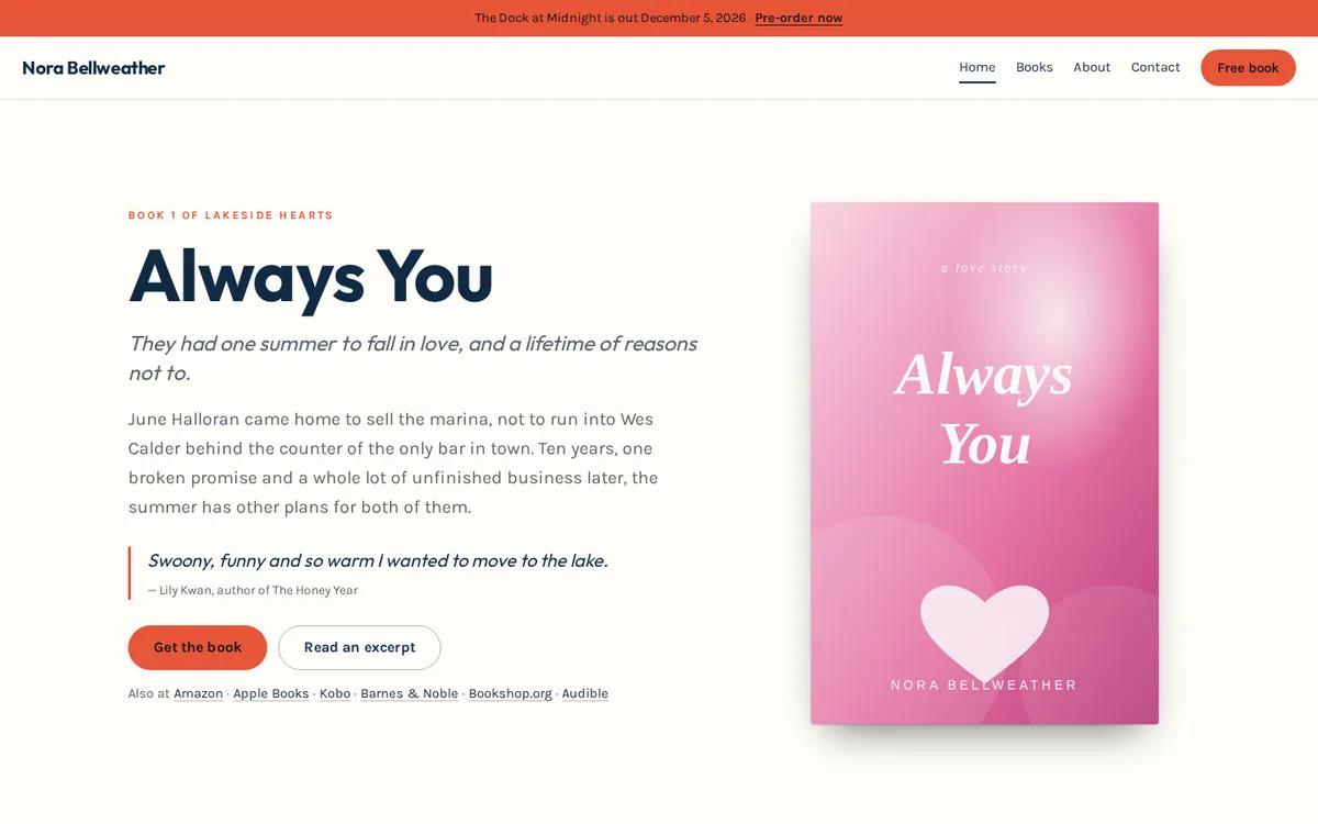
Bright, modern and confident, with bold sans-serif headings. Saltmarsh reads well on a phone, which is where most younger readers will see it first.
Nonfiction, business, speakers and coaches: Ledger
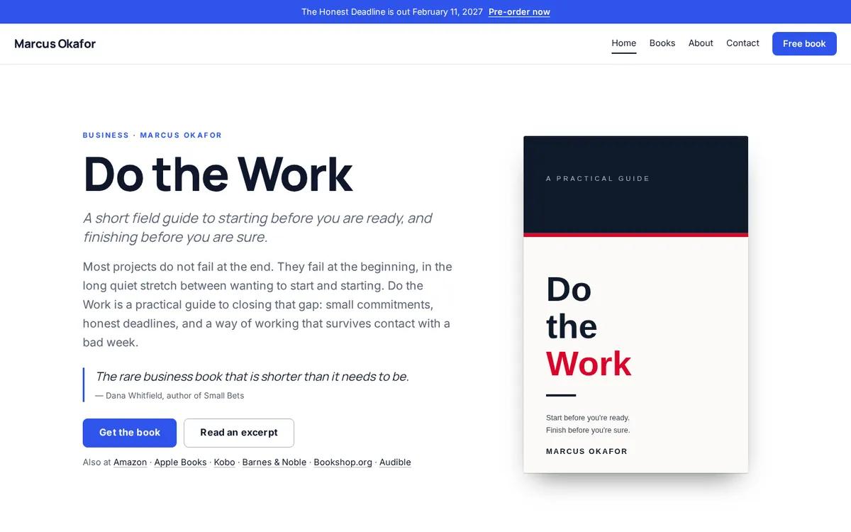
Crisp white, a strong blue and a clear sans-serif. Nonfiction readers want to know what they will learn and who is teaching it, so Ledger leads with the promise of the book and leaves room for speaking and coaching pages.
Poetry, essays and literary minimalism: Monograph
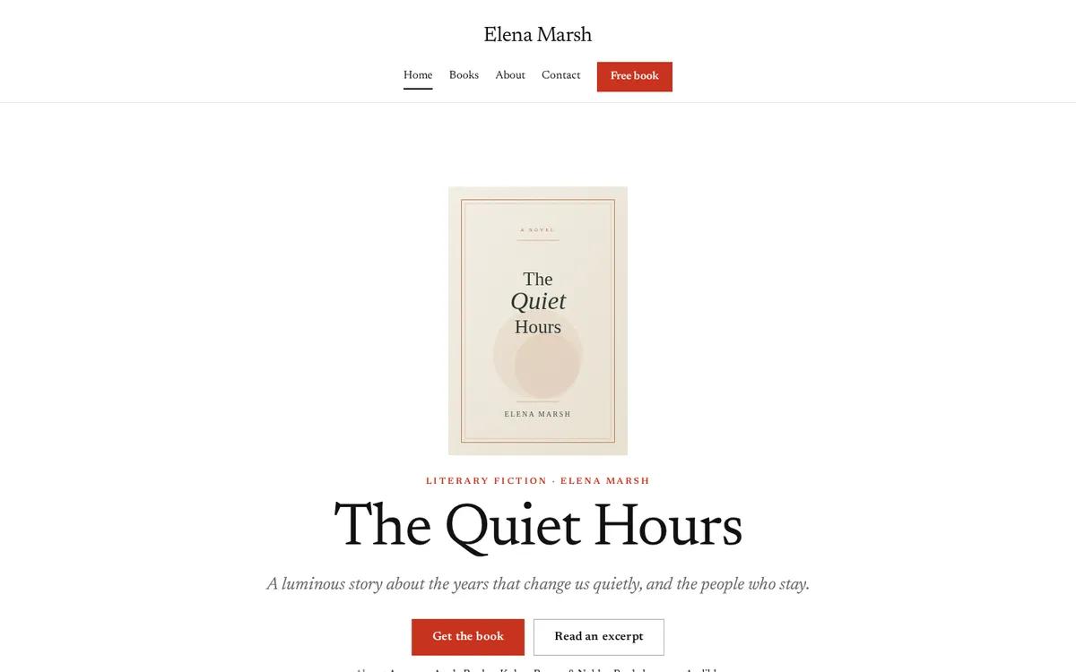
White, dark type and space, with everything centered. Monograph treats the page the way a good poetry press does: nothing competes with the words.
What every good example has in common
Whatever the genre, the designs above share the things that matter more than any color choice:
- The newest book first, large, with one obvious button.
- A page for every book, with every store and format.
- Series in reading order, one click from the home page.
- One reason to join the list, repeated, never shouted.
- Readable on a phone, which is where most visitors arrive.
See your books in every one of them
Choosing a design is easier with your own covers in it. Paste a link to one of your books and AuthorSend shows you your website in the design your genre suits, then in all twelve, each drawn with your books, before you make an account.
See your author website